
Zenith | Fitness Studio
Zenith | Fitness Studio
At Zenith, women explore hobbies that go beyond fitness from meditation to running, and outdoor adventures. It’s a space to move and grow together.
At Zenith, women explore hobbies that go beyond fitness from meditation to running, and outdoor adventures. It’s a space to move and grow together.

Project Overview
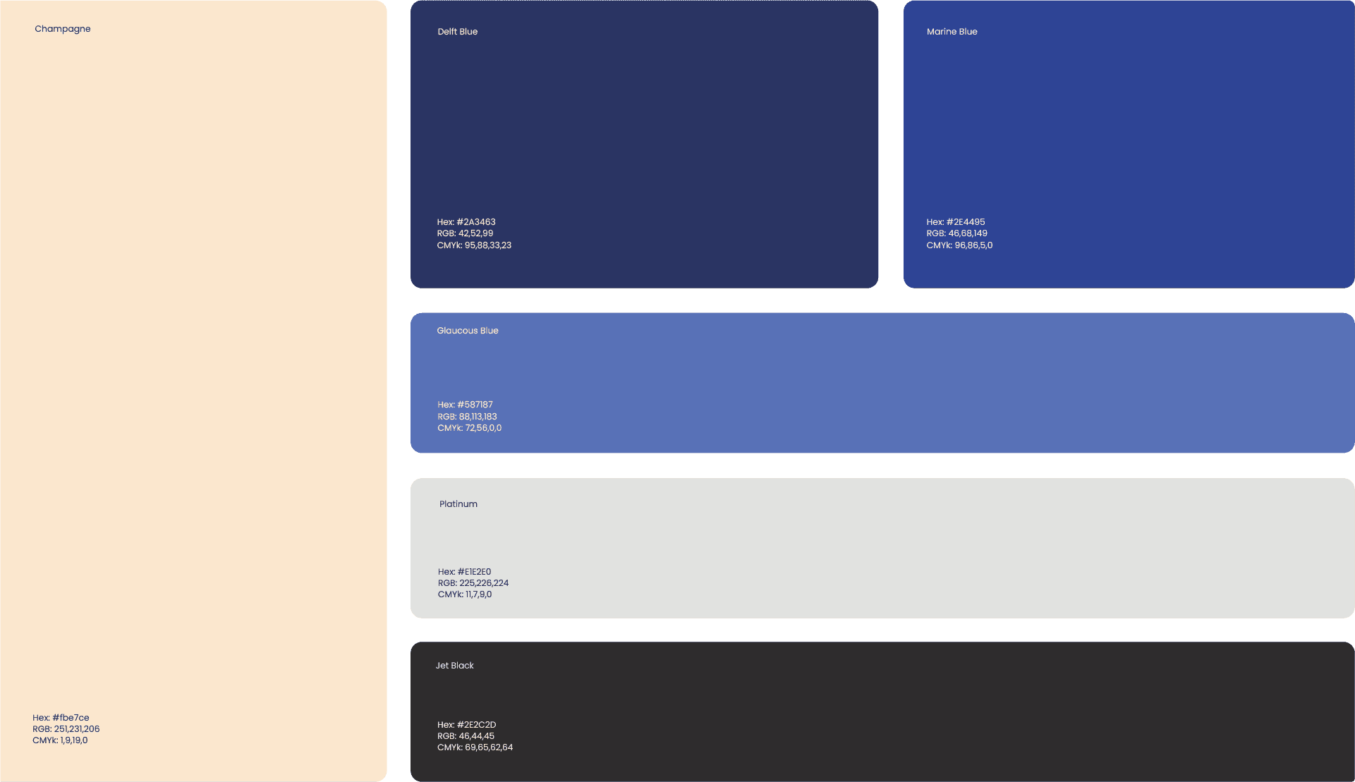
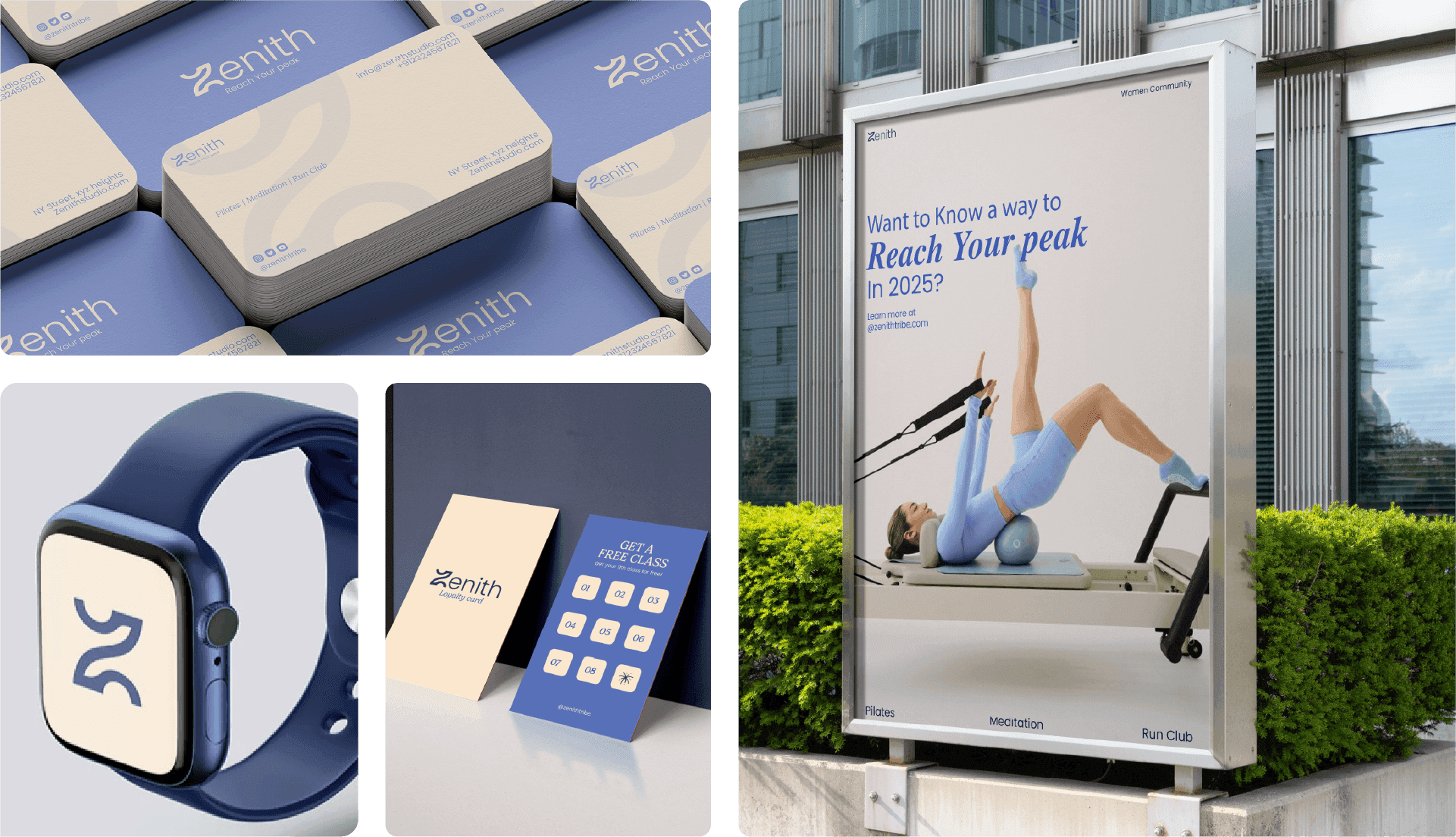
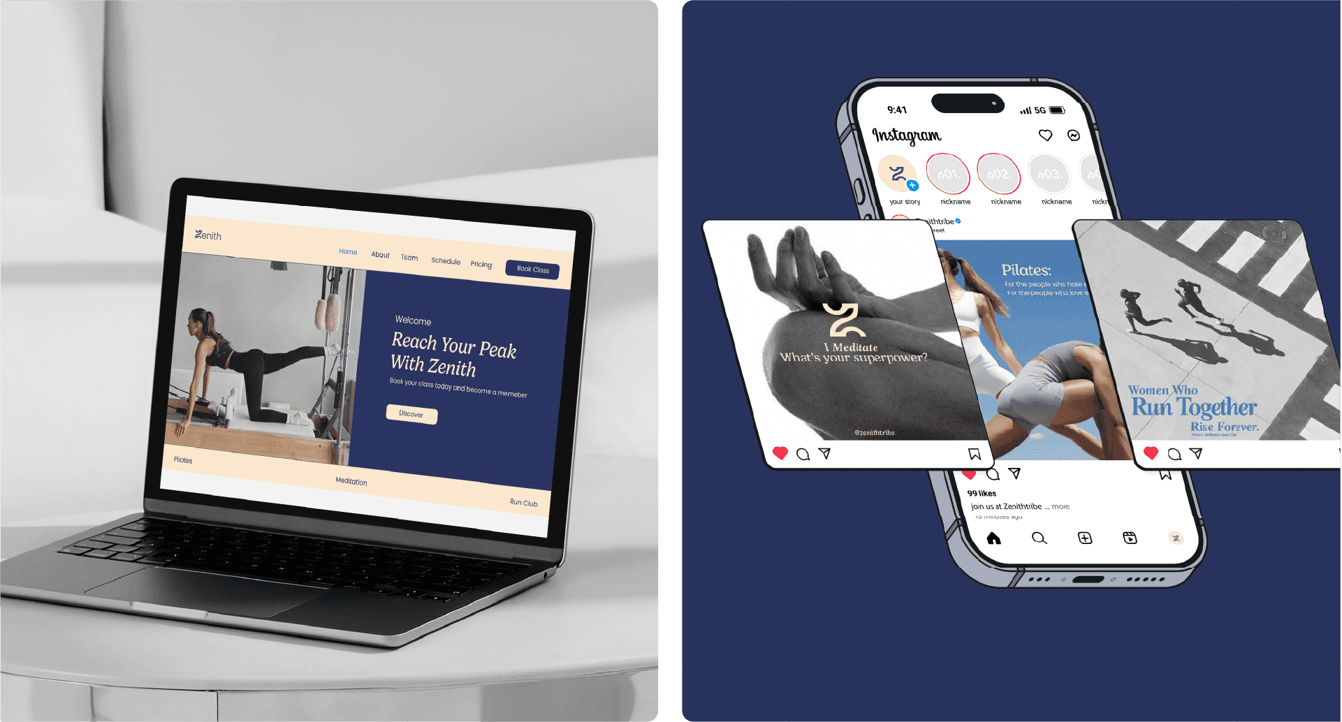
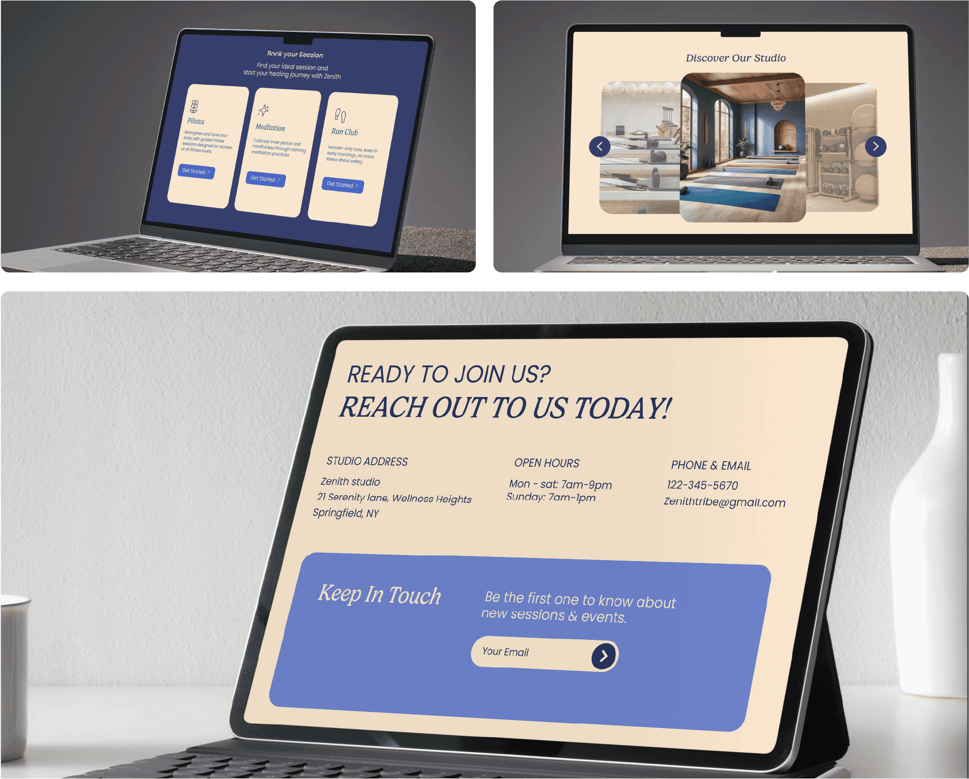
Zenith is a women’s fitness and wellness studio built around strength, balance, and community. The branding project includes a calm yet empowering identity system with logo, colors, typography, and brand guidelines to ensure a cohesive experience.

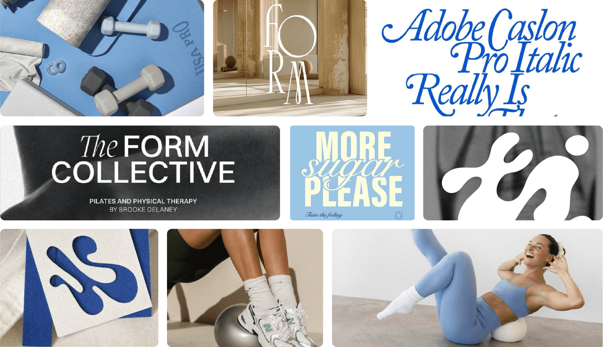
The moodboard reflects a sense of calmness through soft beige and blue tones, which create a soothing and balanced visual base. The use of cursive typography adds a gentle, feminine touch, making the overall mood feel warm, elegant, and emotionally inviting.
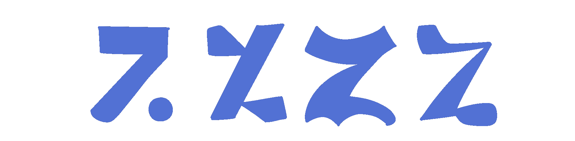
During ideation, I explored soft, feminine shapes inspired by natural movement to express balance, strength, and mindfulness. I also experimented with the letter Z, using it as a starting point to create fluid forms that reflect motion and flow.
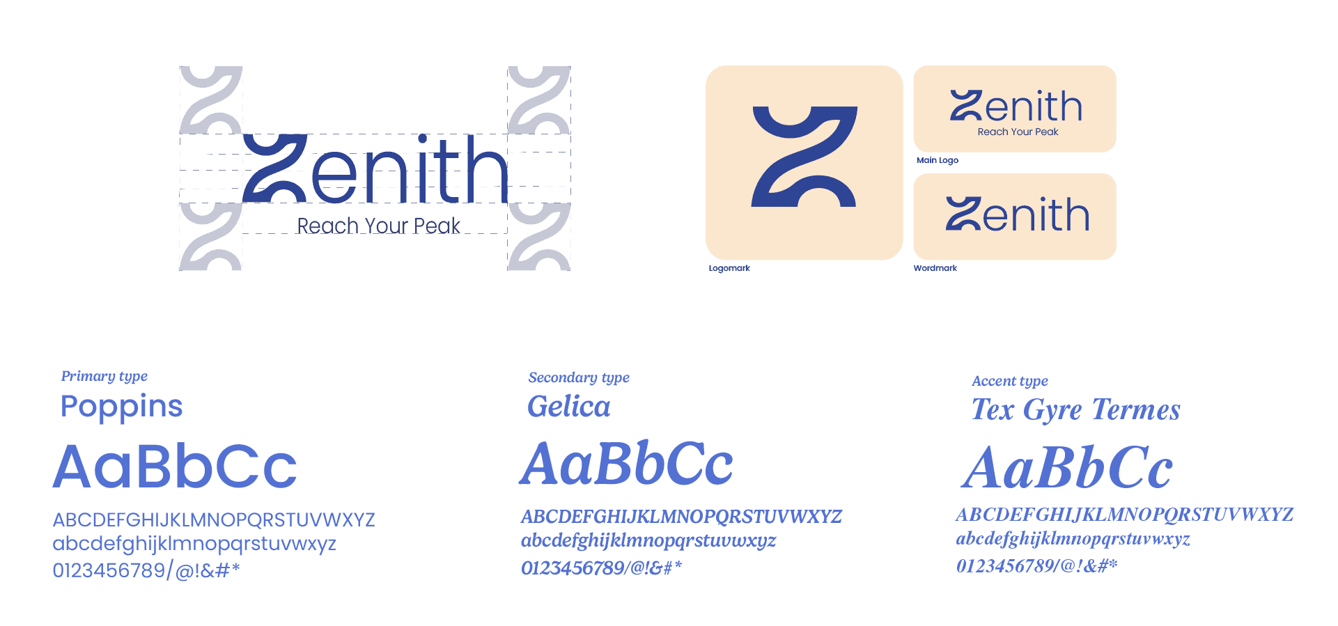
Logo Construction
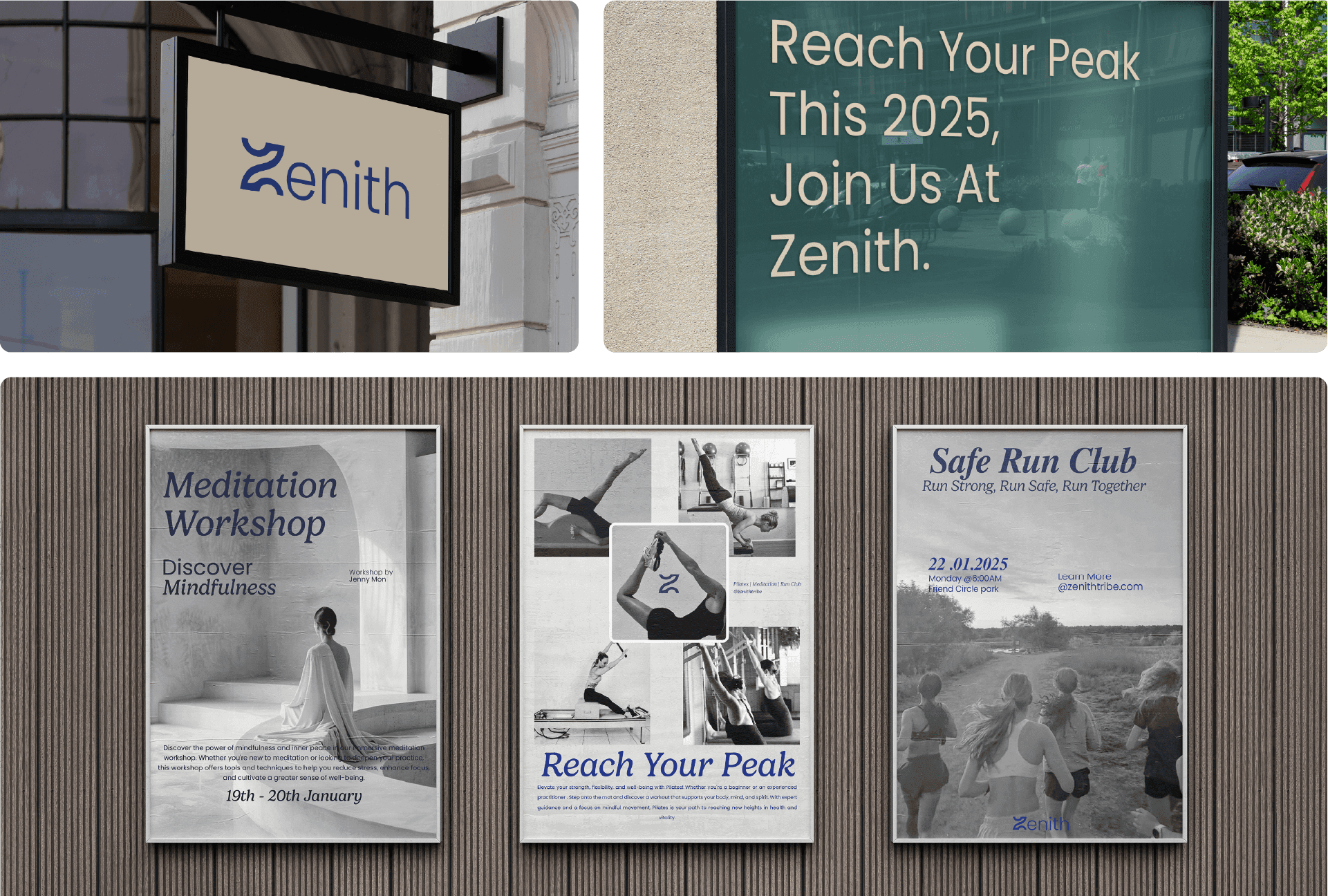
The logo uses a stylized “Z” that represents Zenith and the idea of reaching your highest point. Its smooth curves show movement and steady progress. The tagline supports this by highlighting the studio’s goal of helping women grow and succeed on their fitness journey.
Project Overview
Zenith is a women’s fitness and wellness studio built around strength, balance, and community. The branding project includes a calm yet empowering identity system with logo, colors, typography, and brand guidelines to ensure a cohesive experience.
The moodboard reflects a sense of calmness through soft beige and blue tones, which create a soothing and balanced visual base. The use of cursive typography adds a gentle, feminine touch, making the overall mood feel warm, elegant, and emotionally inviting.
During ideation, I explored soft, feminine shapes inspired by natural movement to express balance, strength, and mindfulness. I also experimented with the letter Z, using it as a starting point to create fluid forms that reflect motion and flow.
Logo Construction
The logo uses a stylized “Z” that represents Zenith and the idea of reaching your highest point. Its smooth curves show movement and steady progress. The tagline supports this by highlighting the studio’s goal of helping women grow and succeed on their fitness journey.
